On this page
A handwritten note left on your desk by a Japanese colleague can stop you cold, even when you would have read every word of it in print. The reason is narrow and fixable: a small set of kana and a couple of radicals are drawn differently by a moving pen than by the printed font you first met them in, and once you know which ones and how they shift, the rest of the handwriting falls into place. None of it is a new script. You are reading the same kana and kanji, drawn the way a pen moves rather than the way a press sets them.
The font taught you a shape; your hand writes a motion
Open a textbook and the Japanese on the page is set in 明朝体 (minchōtai), the Mincho family: the serifed print face that Japanese books and websites default to. It was built for the press, not the pen, and it makes choices a hand never would. It thickens stroke ends into little triangular feet, and it fuses or splits strokes to balance a character inside a square of type. Primary schools know the font misleads, which is why their textbooks are set in a second face, 教科書体 (kyōkashotai), drawn to match how a hand forms each character. The gap you are trying to cross is the gap between those two faces.
Before cataloguing it, scope it. Japanese handwriting comes in three registers, and you need to read only two of them.
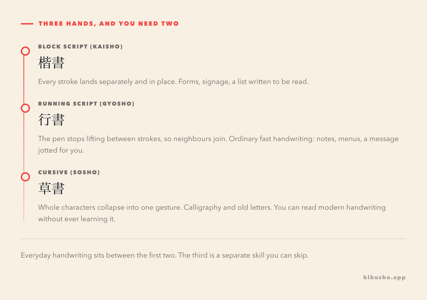
Block script, 楷書, is handwriting with every stroke in place: forms, signage, a list someone wants you to read. Running script, 行書, is what a pen does once it stops lifting between strokes, so neighbouring strokes join and the character flows. Almost all everyday handwriting lives between these two. Cursive, 草書, where a whole character collapses into one gesture, belongs to calligraphy and old correspondence, and you can read a lifetime of modern notes without it. So the task is bounded: read 楷書 and the lighter end of 行書, and leave the rest.
The characters where print and the pen disagree
Here is the catalogue. It is short, which is the whole reason to learn it as a set rather than meet each surprise cold.
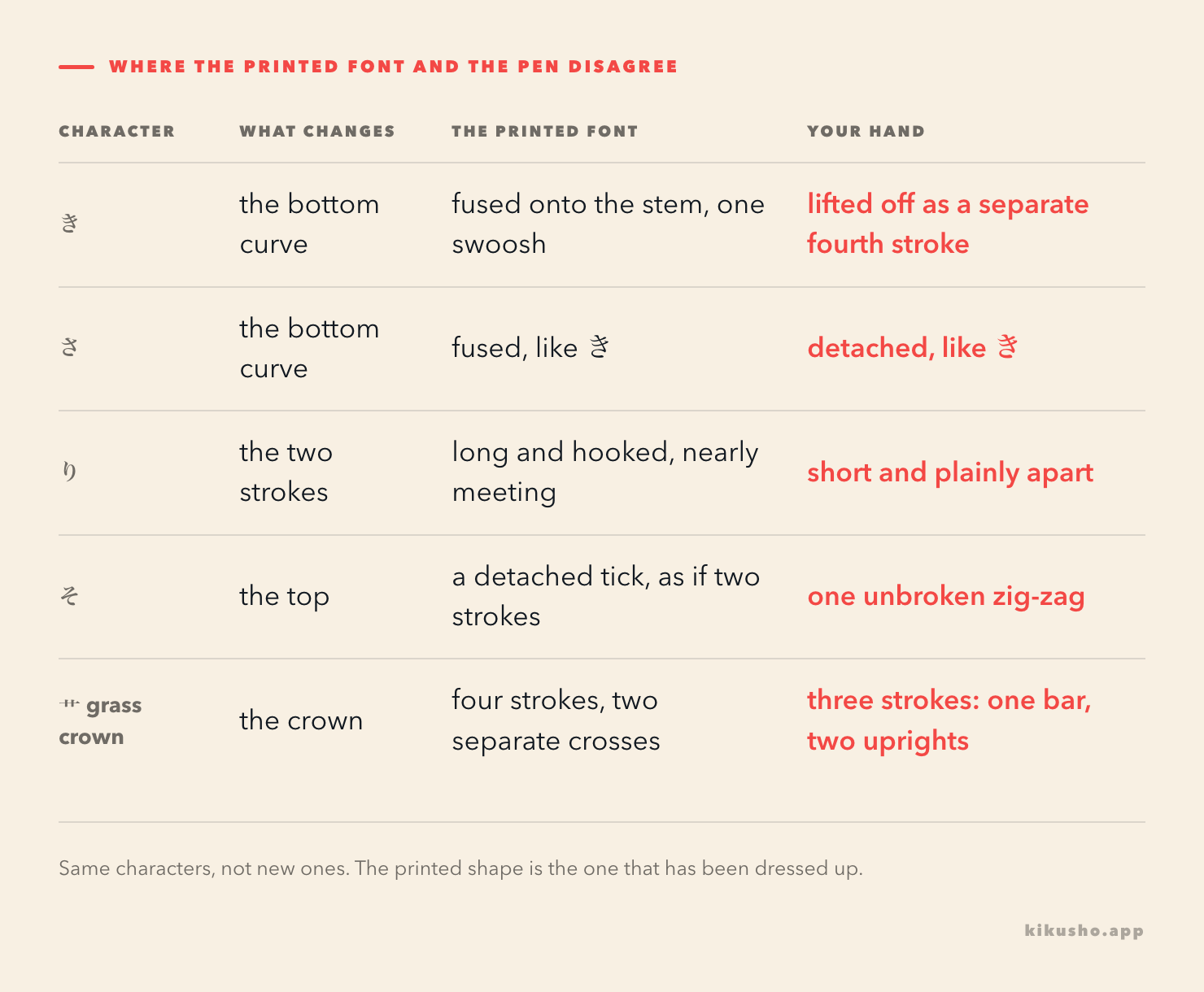
Three of the five are kana whose bottom the print font pulls together. In Mincho, the lower curve of き joins the vertical stroke above it into one continuous swoosh; a hand lifts the pen there and leaves the curve as a separate, lower fourth stroke. さ does the same thing for the same reason, so the two move together. り is drawn in print as two long, hooked strokes that lean toward each other until they almost touch; by hand they are short, straight and plainly apart. そ carries a small detached tick at the top in many print faces, as though it began with its own stroke, where a hand writes it as a single unbroken zig-zag.
The fifth is not a kana but a radical, and it is the one you will see most. The grass crown 艹, on top of 花, 茶, 薬 and dozens of other characters, is drawn in Mincho as four strokes: two little crosses side by side. By hand, and in the form schools now teach, it is three: one horizontal bar with two short uprights through it. Once you expect three strokes there, a whole column of plant-and-medicine kanji stops looking wrong.
Stroke order is the information the printed shape hides
Notice what all of these share. The divergence is never random; it is always about the pen's path. Where a hand joins two strokes, it is because they follow one another in the character's stroke order and the pen did not bother to lift. Where a hand separates what print fused, it is because the formal font squeezed two real strokes into one shape. The printed form is a finished picture. The handwritten form is a record of how the picture was made.
This is why knowing roughly how a character is formed pays off for reading handwriting even though it does nothing for reading print. In print the order that produced a character leaves no trace: a kanji written in any sequence is the same dry picture once set in type. In handwriting the order is visible, because the joins and the sweeps are the order. A reader who knows that 言 is built from the top down, the short stroke first and the mouth last, can follow a hurried 言 whose horizontals have melted into one wavy line. Someone who only memorised the block shape has nothing to hold onto.
It also explains why handwriting makes confusable kanji harder rather than easier. When a radical collapses toward its stroke-order skeleton, two characters that differed only by a careful detail can briefly land on the same scrawl, and the reading has to come from the surrounding words. That is normal. Native readers lean on context for exactly this, constantly.
The ones a static shape can't settle
Two cases push past the catalogue, because for them the shape on the page is genuinely not enough. The katakana シ, ツ, ソ and ン are the classic trap, and not only for learners.
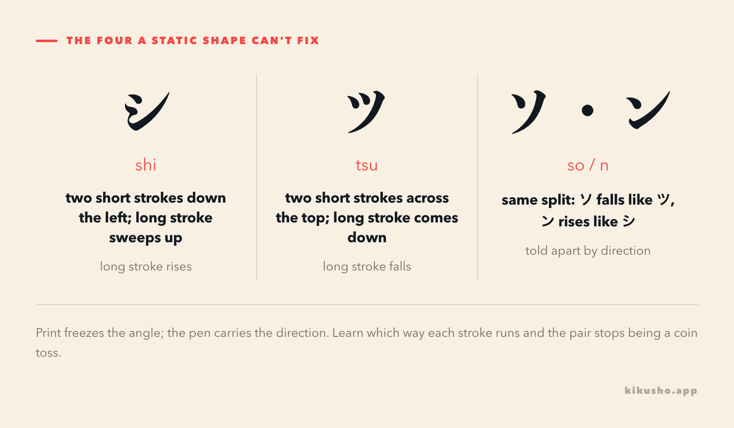
シ and ツ are each two short strokes plus one long one. In シ the two shorts run down the left side and the long stroke sweeps upward, bottom to top. In ツ the two shorts sit across the top and the long stroke comes down, top to bottom. ソ and ン split the same way: ソ falls like ツ, ン rises like シ. In clean print the angle alone usually gives it away. In fast handwriting the angle blurs, and the only reliable cue is the direction the pen travelled, which a frozen shape cannot show you. The fix is not to stare harder at the finished form but to learn the stroke direction of each, so that even a sloppy one still carries it. This is the same lesson as the radicals, pushed to its edge: when print and pen disagree, the pen is carrying the stroke order, and here the stroke order is all there is.
You build the skill by meeting it, not by drilling a chart
You will not get far treating the grid above as a table to memorise. The catalogue is there so the forms stop surprising you, not so you rehearse them in the abstract. The skill arrives by reading real handwriting with the set in the back of your mind: a board of specials, a sign taped to a shop window, a note left in the margin of a borrowed book. Two moves speed it up. Where an app or a reader lets you choose the font, set it to 教科書体, so the shapes you spend hours on are the ones a hand makes rather than the ones a press makes. And form a few characters by hand yourself, in order, not to remember them but because producing a shape in sequence is the quickest way to recognise it when someone else produces it the same way.
The handwriting you'll actually meet, and why the list ends
In a normal month in Japan the handwriting you meet is narrower than the fear of it. A handwritten izakaya menu, or the day's specials chalked on a board. A note a colleague leaves, a delivery slip, a form at a clinic, a price or a 品切れ scrawled over a printed menu. A message a friend writes out by hand. All of it is 楷書 or light 行書, all of it drawn to be read by someone, and all of it drawing on the same short catalogue above.
That is the gap Kikusho is built to close at the moment it opens. The instant you untangle a handwritten word off a menu or a slip is the instant it is most likely to slip away again, because your attention went into decoding the shape and none was left for the word. So hand it over right then, in whatever form you have it: read aloud the reading you just worked out, or type it, and a card comes back with the meaning, the register and an example to check before you keep it, then returns on an FSRS schedule that runs with no signal. The deciphering was the work. Keeping the word should not cost a second round of it.
What makes handwriting different from vocabulary is that the list of surprises ends. New words arrive for as long as you keep reading, but the ways a pen departs from the printed font are a closed set, mostly the handful above. Meet them once, expect them from then on, and you are not learning to read handwriting for the rest of your life. You finish.
Common questions
Do I need to learn cursive (草書) to read everyday Japanese handwriting?
No. Everyday handwriting is block script (楷書) and light running script (行書), where strokes join but characters stay recognisable. Cursive (草書), in which whole characters collapse into a single gesture, is a separate skill used for calligraphy and historical documents, and you can read modern notes, menus and forms without it.
What is 教科書体, and should I switch my reading to it?
教科書体 (kyōkashotai) is the textbook font used in Japanese primary schools, drawn to match how a hand forms each character rather than how a press sets it. You do not have to read everything in it, but recognising it helps: it shows the detached bottom of き and さ, the three-stroke grass crown and the other handwritten forms the way you will actually meet them.
Why can I not tell シ from ツ even when I know both characters?
Because the difference is mainly in the direction each stroke is written, not in the final shape. シ's long stroke sweeps upward and its short strokes run down the left; ツ's long stroke comes down and its short strokes sit across the top. Printed clearly the angle shows it, but in handwriting you have to know the direction to read it.
Does reading handwriting mean learning a different alphabet?
No. It is the same hiragana, katakana and kanji as print. Only a small, closed set of characters is drawn noticeably differently by hand, and that set is what this article lists.